Announcing the new DocRead 365 Analytics ModuleWe are thrilled to announce the release of ...
Creating a SharePoint document library dashboard
SharePoint provides excellent opportunities to create document repositories. You may already have several document libraries containing all of your important company information. Policies, procedures, SOP's, and lots of other types of documents can be stored safely and securely in SharePoint.
This in itself leads to more problems! How do your users know which documents they need to read? How do your content owners know when users read the documents and if they fully understood them?
DocRead is an add-on for SharePoint that allows you to target and track content to the right users in your organization.
DocRead comes with a report suite that is accessed from the DocRead admin pages inside SharePoint. Whilst powerful out of the box, it’s impossible for the suite to cover more customized reporting requirements. Also, because the reporting suite runs inside of SharePoint web pages (with no dedicated reporting engine) it can struggle with large data sets containing hundreds of thousands of rows.
Enter Power BI
In this post we are going to show how you can use Power BI to create a “Document Library Dashboard” using the DocRead data. This dashboard can be used to show the status of the reading tasks associated with a specific document (these tasks are automatically generated, and managed by DocRead ).
With its own dedicated reporting engine (VertiPaq - “Brains & Muscles” behind Power BI), Power BI has no problem working with large data sets. When combined with the rich data created by DocRead, it allows you to create beautiful and powerful reports giving insights about how your SharePoint content is being targeted, read and acknowledged by your users. These reports can also be used to demonstrate to regulators how you are communicating, targeting and tracking your Policies, Procedures (and any other important content) and thus ensuring that your employees remain compliant with them.
Creating a library dashboard
The “Document Library Dashboard“ that we are going to build in this post will look like this:
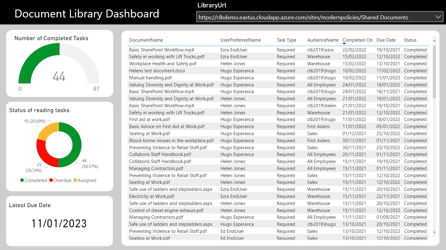
The dashboard above uses the standard data view called "Readership.vwTaskInfo" available in the DocRead database (find more information here). It contains a slicer at the top of the page that allows you to select a specific document library. The table then shows a list of all employees who need to read the documents stored in the selected library and the date they did so. If the employee has not completed their reading task, then this will be shown as either overdue (if the due date has passed) or assigned.
The visualizations on the left include:
- Gauge showing the proportion of completed tasks compared to the total number of tasks.
- Donut chart showing the number or reading tasks by status (assigned, completed or overdue) and their proportionate percentages.
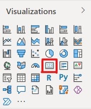
- Card displaying the latest due date. This gives an indication of when all of the documents should have been read and acknowledged.
Note: you may need to see this post first to get your DocRead data into Power BI : How to get your DocRead data into Power BI - Collaboris
Table
1) Firstly, ensure your Power BI canvas is empty. Then select the table visualization. This will add a table onto your report canvas. Move and resize it to the right of your report page.
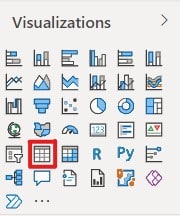
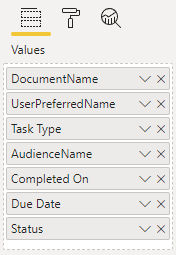
2) From the Readership vwTaskInfo table, select 'DocumentName', 'UserPreferredName', 'ReadershipType', 'AudienceName', 'CompletionDate', 'DueDate' and 'RealStatus' or click and drag them into the Slicer Field. Please refer to this post if you haven't created a 'RealStatus' field.
3) They will appear in the report table in the order they are shown. You can click and drag them to rearrange them as required. In the picture below, I have renamed the following fields:
- 'ReadershipType' to 'Task Type',
- 'CompletionDate' to 'Completed On' and
- 'DueDate' to 'Due date'.
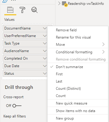
4) Use the drop down arrow at the side of each field to adjust the settings as needed. All fields for this table should be set to 'Don't summarize'.
5) Your data table is ready and should look similar to the example below.

Slicer
1) Firstly, click into a blank area of your report canvas then select the Slicer visualization as shown below. This will add a slicer onto your report canvas. Resize it and move it to the top right corner of your report canvas.
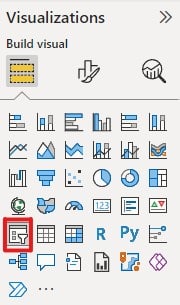
2) From the 'Readership vwTaskInfo' table, select 'LibraryUrl', or click and drag it into the Slicer Field.
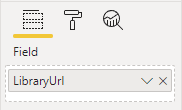
3) On the report canvas, click the down arrow in the top right corner of the slicer and select 'Dropdown'.

4) Your slicer is now ready. Notice how the data in the table changes as you select different Library URL's.
Is your SharePoint content read on time and by the right people?
DocRead can help
Gauge
1) Select the gauge visualization. This will add a gauge onto your report canvas. Resize it and move it to the left of your data table on your report canvas.
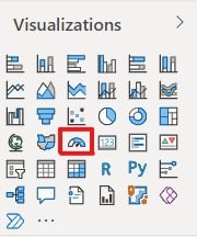
2) From the 'Readership vwTaskInfo' table, select 'CompletionDate' and drag it into the Value Field. Also select 'RealStatus' and drag it into the Maximum value field. Ensure that both fields will be displayed as a 'Count of' their values.
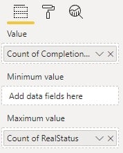
3) If your fields do not show as 'Count of', use the drop down arrow and select 'Count'.
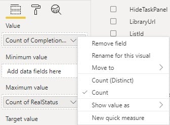
4) Your gauge is now ready and should display the number of completed tasks on the scale with the maximum value reflecting the total number of tasks.
Donut chart
1) Select the donut chart visualization. Resize it and move it to the left of your data table on your report canvas, underneath the Gauge.
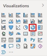
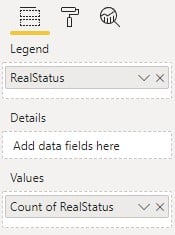
2) From the 'Readership vwTaskInfo' table, select 'RealStatus' and drag it into the Legend Field. Use the same data in the Values field but ensure that this will be displayed as a 'Count of' the RealStatus.
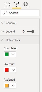
3) Select the paint roller icon to change the colors for the different classes of reading status. Expand the 'Data Colors' option and amend the display colors to your preference. I used green for completed tasks, red for overdue tasks and amber for tasks that have been assigned but are not overdue. I also set the Legend to 'on' so this information is displayed in the visualization.
4) The donut chart is now ready, notice how the values change when you select a different document library.
Card
1) For my final visualization, I wanted to display the latest due date. Due dates can differ because of DocRead's Smart Move feature which will automatically create tasks for new employees when they join the organization. Select the card visualization & position below the donut chart.
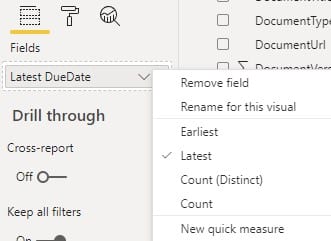
2) From the 'Readership vwTaskInfo' table, select 'DueDate' and ensure it is recorded in the Fields option. This value defaulted to Earliest Due Date, however I want to know when the last due date is. This will give me an idea of when all of the compliance tasks are likely to be completed by everyone.
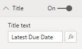
3) I also chose to turn on the Title options for my visualizations. This option is available using the 'Paint Roller' icon and you can add the relevant text and format it as required.
I added a background image to your Power BI report to make it look more appealing. This post explains how I did this.
Is your SharePoint content read on time and fully understood?
DocRead can help
You may also like:
October 24, 2024
June 13, 2022
Creating a SharePoint document library dashboardSharePoint provides excellent opportunities to create document repositories. You ...
May 30, 2022
Create a Reporting Hierarchy in Power BI Creating hierarchies in your Power BI data ...
May 17, 2022
Advanced DocRead reporting with Power BI The DocRead reporting suite provides several reports to help you manage ...
May 16, 2022
Downloadable background templates for Power BI reportsPower BI allows you to create amazing visualizations ...
May 13, 2022
How to import your DocRead data into Power BIThe DocRead reporting suite provides several ...
