Summarizing DocRead Task Information in Power BI
All of the DocRead task data is stored in a SQL database, meaning that it is available for further analysis and reporting with Power BI.
Here's how to create a summary of all DocRead tasks showing the reading status (assigned, completed, overdue) in Power BI. The end result will look like this:
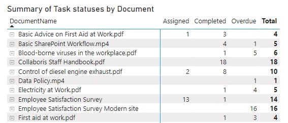
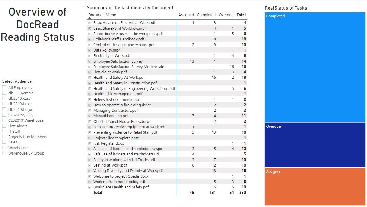
All items assigned by DocRead will be listed and the total number of Assigned, Completed and Overdue tasks shown.
If you click on the '+' symbol by the policy name, you can drill down to see more detail. In this case, only the First Aider has completed the task, all five Warehouse employees have overdue tasks.

Create a new field in your DocRead database to show the "Real Status" of DocRead tasks.
There are two information fields that need to be combined to work out the status of DocRead tasks:
1) The Status field. This is a text field and can either be "assigned" or "completed" and
2) The Task overdue field. This is a boolean field which is calculated from the due date of the task. It can either be "True" (i.e. overdue because the due date was in the past) or "False" (because the due date had not arrived).
Ideally I don't want a completed task to be considered overdue. Only assigned (but not completed) tasks that have passed the due date need to be chased. Please refer to this post to find out how to add and calculate a new field to use in this analysis.
Create a matrix report in Power BI
Add the matrix visualization into your Power BI report.
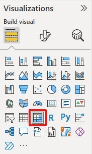
You then need to select the fields that you want to see in the matrix. This can be achieved bydragging and dropping them into the relevant section as shown below.
For the rows in this report I used DocumentName and Audience name.
I wanted to see the "RealStatus" of tasks as columns. This is the field created by following the post above.
I used the RealStatus field to provide the values for my report.
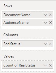
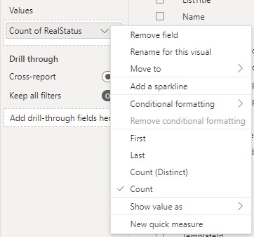
To show the RealValues as a meaningful number, select the down arrow and select 'count' as shown. This will count all of the tasks for a document with that status.
Adding a Slicer
It is also easy to add a slicer to this Power BI report to only show the tasks associated with a specific audience.
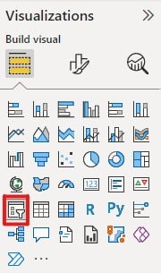
Before adding the slicer, make sure you do not have anything selected on your Power BI report. Then select the Slicer visualization as shown below.
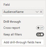
Drag and drop the "AudienceName" field into the slicer.
Notice that the details in your Matrix report change based on the options you have selected in your slicer.
You can change the format of the slicer by selecting the "paintbrush" icon as shown below.
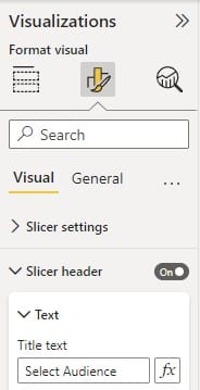
I turned on the Slicer header and entered "Select Audience" to use in my visualization.
Add other visualizations as required
Treemap
I also added a Treemap to visualize the status of the DocRead tasks. This displays the number of tasks in different sized boxes. The greater the number of tasks (relative to the other options) the larger the box.
Again, before adding the treemap, make sure you do not have anything selected on your Power BI report. Then select the Treemap visualization as shown below.
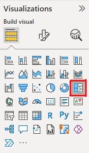
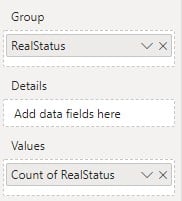
Drag the "RealStatus" field into the Group and also use it as the Value. Amend the value to show the 'Count of' as before. Your selection should appear as below.
My final report looked like this (I know - it could be prettier, design is not one of my strengths!)
Once you have the basic information in your visualization, you can easily change its style by selecting another visualization. You need to click on the visualization you want to replace and ensure that it is outlined in grey and highlighted in the visualizations pane first e.g.
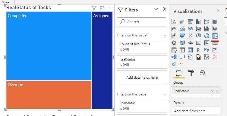
Then select the visualization you would rather use.
Donut chart
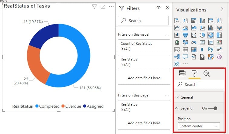
Without changing the fields, changing the visualization to a donut chart looks like this...
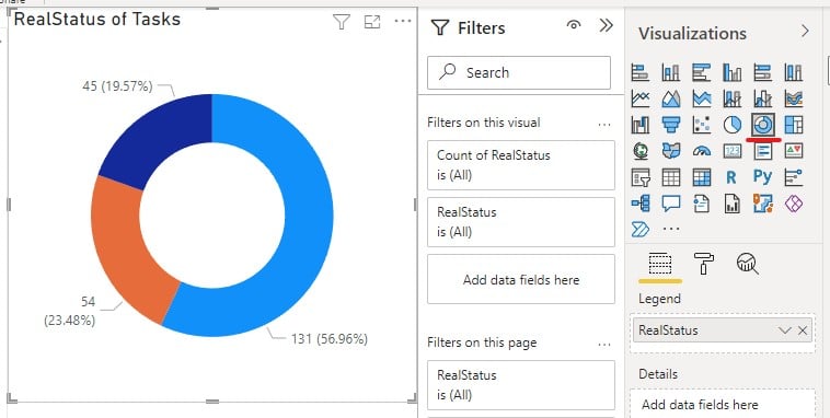
To add a legend to the chart, select the 'paint roller' and use the toggle button to turn the Legend on. Then position it wherever you prefer using the drop down options.
Stacked Column Chart
Again, without changing the fields, changing the visualization to a stacked bar chart looks like this...
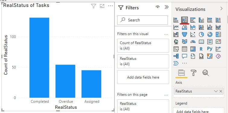
Notice how the visualizations change when using the slicer to select specific audiences or group.
I hope you've found this useful and have fun making your own reports in Power BI

